Homely
Homely is a conceptual interior design app. With partnerships with the top furniture stores across the US, Homely aims to provide a platform where users can browse the catalog, place orders, and view the furniture using an augmented reality (AR) feature. This project presents an approach to solving problems faced during a user’s furniture shopping experience by integrating AR technology.
Project Overview
Challenge
Design a new interior design app to help improve a user’s experience while shopping for furniture through the integration of an AR feature.
Solution
Design a new app that helps users browse a furniture catalog and view products in their homes using AR.
Define a unique brand identity that reflects Homely’s attributes
Role
UX, UI Designer
Time
4 weeks
Task
Design a new interior design app integrating an AR feature
Tools
Figma, Photoshop
My Process
Empathize
Research
Since I wasn’t very familiar with the furniture retail industry, I began with some secondary research to gain a better understanding of the market trends and demographics. I then conducted interviews to learn more about the different experiences people have had with furniture shopping.
Through my research, I wanted to:
Understand the market trends of the interior design/furniture industry
Identify Homely’s target market
Identify Homely’s competitors and evaluate their strengths and weaknesses
Learn about the current trends of AR and how it’s being used in businesses
Understand the experiences people have when furniture shopping
Discover the goals, needs, motivations, and frustrations of Homely’s users
Market Research
To learn more about the market trends and demographics of the furniture industry, I started with market research with the help of Google. Through market research, I was able to gain a more thorough understanding and fill in the gaps of my knowledge about the industry to better inform my design decisions moving forward. Here are some of the key insights that I discovered:
Consumer Trends
The number of online shoppers has increased by 8.8% since the coronavirus pandemic began
14% of people feel that big retailers have too many options, making it difficult to choose the right furniture
70% of consumers shopping for furniture begin the process online
According to the National Retail Federation, more than 57% of furniture shoppers buy at a physical store. Consumers are largely going online to research to make a decision on which location to purchase from
When it comes to larger furniture pieces (like sofas and beds) that are expensive, consumers still prefer to make their purchases in stores, where they can have the tactile experience of seeing and feeling a piece before pulling the trigger
Currently, only 14 percent of those shoppers say they actually make the final purchase online, that number is growing
Demographics
In 2017, almost 30% of furniture consumers were between 25-34 years old.
Almost half of millennials research on-line before heading to a furniture store, with the next largest population being Gen X
Share of Americans who plan to buy furniture in the next 12 months in 2018, by age: 33.33% respondents 18-29 years; 34.55% 30-49 years; 22.99% 50-64 years
43.13 percent of respondents aged 18 to 29 years stated that they bought furniture in the past 12 months; 38.57% 30-49 years; 25.2% 50-64 years
Furniture and Home Accessories purchases: Women are the sole decision-makers 53% of the time, followed by a joint decision 27% of the time
Augmented Reality (AR)
According to Centric Digital Augmented reality in retail study on US customers, furniture is the top product people want to shop with AR (60%).
68% of respondents also said they would want to spend more time at stores or online if it included augmented reality. Moreover, 40% stated they’d be ready to buy more expensive products.
72% of customers purchased products they hadn’t planned because of Augmented Reality.
Generally, people find AR positive, helpful and fun, and 45% respondents said it had saved them time.
Competitive Analysis
After learning more about the industry, I wanted to take a closer look at Homely’s competitors and how they’re helping their users shop for furniture. Through my market research, I identified some top direct and indirect competitors within the industry: Wayfair, IKEA, Houzz, Amazon, and Target. Direct competitors are furniture-focused retailers similar to Homely, while indirect competitors aren’t focused solely on furniture. Exploring each of their apps, I evaluated the strengths and weaknesses of each to see how Homely could fill in any gaps moving forward.
Provisional Personas
To start getting an idea of who Homely’s users are, I used everything that I have learned so far from my secondary research to create provisional personas. This helped me to determine the criteria for participants I would recruit for my user interviews and start understanding what their needs might be based on their gains and pains.
User Interviews
In order to learn about the real experiences people have had while furniture shopping, I recruited 5 participants (fitting within the criteria of the provisional personas) for user interviews. Here, I focused on asking open-ended questions about their experiences to learn as much as possible about our users and validate my understanding of them from my provisional personas.
“I guess it’s easier to make a decision when there’s a sample, and you can interact with the sample. That way I can assess the quality, if it’s worth the money, and if it’s really going to meet my needs… That’s kinda more difficult online since you can’t interact with it.”
Empathy Map
To synthesize all the information I had gathered from the user interviews, I wrote my findings on sticky notes and created an empathy map. By identifying common patterns across my findings, I was able to uncover key insights which helped me understand who Homely’s users are and what they truly need.
From the major patterns that I identified from the empathy map, I discovered the following key insights which helped me to understand what the user’s needs are:

Value & Price
All people shared how price is a factor when making decisions to purchase furniture

Expectation vs. Reality
All people shared experiences on how the actual furniture item ended up being different from their initial expectations.

Finding the Perfect Item
Everyone shared experiences around finding that perfect item that fits all their needs/wants.
Insights
People want to make purchases when they know they’re getting a deal
People want the furniture they purchase online to match their expectations in-person
People have difficulty finding exactly what they’re looking for
Needs
To know when the furniture they want is on sale
To be able to accurately evaluate what a product is really like online
To be able to effectively find furniture that fits their personal criteria
User Persona
To make sure that my decisions moving forward in the process are user-centered, I wanted to have a clear understanding of who Homely’s users are. Using what I learned from patterns from my empathy map, I created a user persona to represent who I will be designing for - Meet Carrie!
Define & IDeate
Defining the Problems
Now with my understanding of Homely’s user, Carrie, I wanted to start thinking about what problems we are trying to solve for her. Taking the insights and needs from the empathy map, I started to dig deeper to better understand what Carrie’s problems are by creating point-of-view (POV) statements and How Might We (HMW) questions that would help drive my brainstorming process.
Brainstorming
Taking the HMW questions, I started my brainstorming process to come up with solutions for each of these problems. I decided to use mind mapping so that I could quickly generate as many ideas as I could.
How might we help Carrie find the perfect item for her home that fits her preferences?
Project Goals
After brainstorming, I had generated a lot of different ideas for these problems. At this point, I started laying out a strategy to help determine what goals I’m trying to meet and to help me determine which solutions I need to prioritize.
First, I started by defining the project goals to get a clear understanding of what we’re trying to achieve and where the business and user goals align.
Product Roadmap
I then worked on a product roadmap to determine which solutions and features we would prioritize based on how effectively we would be able to meet these goals. For this project, I focused on the first priority items to create a MVP, which we would be able to continue to build out lower priority items for future product development.
Application Map
To start planning the architecture of the application and where these features would fit into it, I created an application map to organize the screens in a way that would be logical and intuitive for our user.
Task Flow
I had a clear idea of the architecture of the app, however, I wanted to continue to better understand how Carrie would be interacting with the key screens and features in the app.
I first started by identifying what key tasks the user would be trying to complete when using Homely based on the users’s goals. Then, I fleshed out the specifications for the key screens we would need to design to help our users complete each of those tasks. Finally, using this information, I started my process of understanding our user’s interaction with the app with task flows. These task flows helped me to see how our users would be completing these key tasks - what screens they would be interacting with and what actions they would be taking in a linear flow.
User Flow
Now I wanted to dive even deeper and get a better understanding of the overall journey Carrie would be taking throughout the app from start to finish. I wanted to better empathize with the scenario she may be in, different decisions she would be making, and also the different paths she might take to complete the key tasks I identified. To do this, I created a user flow to step into Carrie’s shoes.
Lofi Wireframe Sketches
Using my understanding of the user, our goals, the architecture, and the user’s interaction with the app, I worked on making informed decisions on how to design Homely’s screens by sketching low-fidelity wireframes.
Prototype & Testing
Sketches to Prototype
Now that I had sketched out my ideas, I wanted to test the decisions I made and make sure that the structure and flow of the app is intuitive for our users. Before working on the visual design, I wanted to first make sure that the design was functional. In order to do this, I decided to create a mid-fidelity prototype which would help me quickly test the design on real users and make any priority revisions before integrating the branding and visual design.
Mid Fidelity Wireframes
To create my prototype, I first started by creating mid-fidelity wireframes on Figma of the key screens the users would be interacting with.
Mid Fidelity Prototype
Taking the wireframes, I then worked on creating a mid-fidelity, limited functionality prototype, using Figma, to use for usability testing.
Usability Testing
For usability testing, I conducted remote, moderated Think Aloud testing over Zoom. The users were asked to share what they were doing, thinking, and feeling while interacting with the prototype and trying to complete the tasks given to them. I tested around the key tasks I identified earlier in the process, asking the user to browse a general category of furniture, find a specific item, and then use the AR feature to view the item in their room.
Overview
Method: Remote, moderated usability testing (Think Aloud)
Participants: 5
Age range: Millennials
Average Time: 4.4 minutes
Task Completion Rate: 95%
Error-Free Rate: 99.4%
Overall, the testing showed positive results, but there were distinct areas in which users did face difficulties.
Affinity Map
To synthesize my findings from testing, I took all my notes and observations and created an affinity map. This helped me to better digest the different patterns observed while testing and pin point where revisions need to be prioritized to improve the usability of the design.
Based on the prominent patterns observed related to the users’ pain points, I was able to uncover insights which helped lead to specific design recommendations:
Pain Points
5/5 users didn’t feel confident when trying to find the right category to browse in the “Shop by Department” section (3/5 users specifically expressed some confusion with the broad “Furniture” category)
4/5 users had some difficulty finding out how to change the color in the AR feature (5/5 users successfully used the AR features when presented with instructions)
4/5 users said they would narrow options down more if they could (3/5 users tried to utilize the sub-categories on the product listing screen)
Insights
People want to be able to start their search by more specific categories related to what they’re looking for.
Clear guides help people learn how to use new features.
People want to be able to focus their browsing specifically around what they’re looking for.
Recommendations
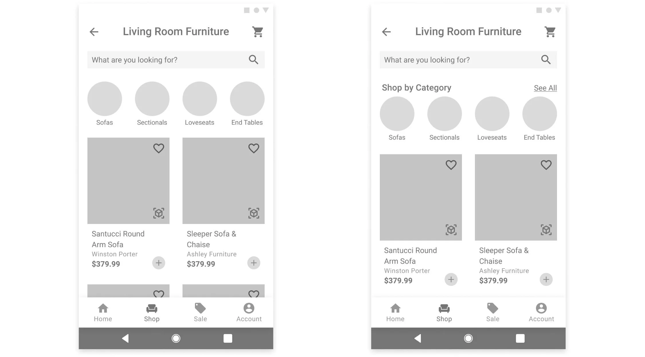
Change the categories in the “Shop by…” sections to more room-specific categories (Living Room, Bedroom, etc.) and an “All Furniture” category
Add instructions on how to edit the product in the AR feature after placing the item
Add a “See All” link above the subcategories on the product listing screen so users can more easily view more specific categories
Priority Revisions
Taking what I learned from my affinity map, I began to make revisions to my design based on the recommendations identified.
1. Change the categories in the “Shop by…” sections to more room-specific categories (Living Room, Bedroom, etc.) and an “All Furniture” category
During testing, I found that many of the users found the “Shop By” categories to be confusing or too broad. To make the categories clearer, I changed the wording for some categories and standardized the categories to be more room-specific.
2. Add instructions on how to edit the product in the AR feature after placing the item
When users were using the AR feature, they were able to successfully go through the flow without issues when guides were provided, however, struggled when trying to edit the item’s color (where no guides were initially provided). To help the user learn how to use this feature, I added another guide that informs the user how to edit the item.
3. Add a “See All” link above the subcategories on the product listing screen so users can more easily view more specific categories
When browsing for a specific item, many users mentioned how they wanted to be able to narrow down options. To help the user narrow down the options, I added a label and a “See All” link for the product listing sub-categories. This way, the sub-categories are clearly communicated to the user and they can click the link to view all the smaller categories to narrow down the options.
UI Design
Branding
After making the revisions to my design to improve its usability, I now wanted to think about how we would convey Homely’s brand visually. Homely’s branding reflects the attributes: Inviting, Joy, Reliable, Simple, and Modern and I worked on setting the visual direction of their branding to convey their unique identity.
Mood Board
I first began by gathering inspiration on Pinterest - looking for different brand elements around their brand attributes. I looked at different things such as color palettes, typography, logos, and imagery to help set the direction of their branding.
Logo Design
Now that I knew what direction we are headed towards for their branding, I started working on creating a logo that would represent their brand. I started by brainstorming around their key attributes and then quickly sketching out different ideas that came to mind. Afterwards, I narrowed down my options to the one that I felt was the most successful and unique in conveying their brand attributes.
Style Tile
After designing Homely’s logo, I then started working on finalizing Homely’s visual identity and created a style tile.
For Homely’s branding, I focused on creating a balance between Homely’s joyful, friendly nature, while still maintaining their reliability. The rounded shapes still provide a sense of structure, and the color palette is energetic, but not overpowering.
UI Kit
Using the style tile as a guideline, I incorporated Homely’s branding into the UI elements used for Homely’s application. To ensure that the design standards remain coherent across future developments or other designers, I created a UI kit to document the elements for reference.
Final Prototype
Taking my revised wireframes, I now worked on creating final, high fidelity wireframes and created a final prototype. With Homely’s branding defined, I worked on incorporating their identity to craft the visual design of their new application.
Welcome to Homely.
Reflection
& Next Steps
As someone who wasn’t very familiar with shopping for furniture or AR, I had to learn a lot through research to gain a more solid understanding. Both secondary and primary research were key in getting up to speed with the market and being able to empathize with other’s experiences, especially since I haven’t gone through those experiences myself just yet.
Overall, this project was a lot of fun to work on - building an app from start to finish, and incorporating a new technology (AR) that I’ve never worked with before. It was interesting to discover how much technology has advanced and learning more about its capabilities and limitations, and look forward to continuing to see how it evolves in the future.
1. Re-Test
With the new revisions and branding incorporated, I would want to test my design again to ensure the design’s usability
2. Hand-oFF
After validating the design, I would hand-off the design to developers or other stakeholders to work on developing the app
3. Product Launch
After the app has been built, we will introduce the new product to the market
4. Add Features
After the first version of the app has launched, I would observe how people are using it and work on updating priorities and adding new features to the app.