
Spotify
Spotify’s mission is clear: “to help people listen to whatever music they want, whenever they want, wherever they want—in a completely legal and accessible way.” As a streaming music service, Spotify is the group lead and it wants to stay that way. In order to help Spotify improve engagement and retention in the app, Spotify wants to expand its social capabilities. For this project, I designed a new social feature in order to help people connect with each other through music.

Project Overview
Challenge
Seamlessly integrate a new social feature to help expand Spotify’s social capabilities and help users connect with each other on a deeper level through music.
Solution
A Mood & Activity feature that allows users to share their current mood and activity with friends and create personalized radios
A Recommendations feature that allows users to help their friends discover new music
Role
UX, UI Designer
Time
4 weeks
Task
Design a new social feature for Spotify
Tools
Figma, Sketch, iPad
Design Process
Empathize
Research
To better understand Spotify’s background, market space, and who Spotify’s users are, I started by conducting research with the following goals:
Research Goals
Understand the market trends of the music streaming industry
Identify Spotify’s target market
Identify Spotify’s competitors and evaluate their strengths and weaknesses
Understand the role music plays in people’s social lives
Understand the experiences people have with music streaming services
Discover goals, needs, motivations, and frustrations of music streaming users
Market Research
In order to gain more insights on what the current music streaming industry looks like, I decided to start with market research. Through market research, I was able to get a deeper understanding of the current trends of Spotify’s market based on data gathered from secondary research.
General
Spotify has become the most popular global audio streaming subscription service
The top competitors of Spotify are YouTube, Pandora, Apple Music, Amazon Prime Music, SoundCloud, and Google Play Music.
Over 20,000 songs are added everyday on the platform.
Spotify deprecated their Inbox/Messaging feature due to lack of user engagement
Usage
44% of users listen to Spotify on a daily basis
Around a third of Spotify listening time is spent on Spotify-generated playlists, with another third going on user-generated playlists
Average users listen to 41 unique artists per week
In each region, Spotify listening is dominated by mobile.
Spotify listeners frequently turn to the streaming service to soundtrack special occasions.
In 2019 more than 60 million users engaged with this feature (Annual “Your Top Songs”), sharing content 40 million times and streaming 6.5 billion songs from the playlists.
Demographics
286 million monthly active users of Spotify
Spotify is the most-popular channel with under-30s
29% of Spotify users are millennials
As of March 2018, Spotify’s user base was dominated by Millennials, with 29 percent of its users aged 25 to 34 and 26 percent aged between 18 and 24 years old
According to a 2018 survey, Spotify reaches almost half of 16 to 24 year olds in the United States each week
Spotify has the most youthful user base of the three platforms (Apple, Spotify, Pandora), with over half of users aged 34 or under, compared with 40% of Apple and 39% of Pandora users
Competitive Analysis
After conducting my market research, I analyzed Spotify’s top competitors to evaluate their strengths and weaknesses. This information helped me to understand what the trends are across all competitors, their unique differences, and why users might choose a particular service over another.
Provisional Personas
Now that I had a better understanding of Spotify’s market space through market research and competitive analysis, I wanted to start exploring and identifying who their target users might be. By creating provisional personas, I was able to quickly start empathizing with Spotify’s users and gain a basis for who I would conduct user interviews with to validate this information.
User Interviews
To validate who the real users are and learn about their personal experiences with music streaming and Spotify, I conducted user interviews. I interviewed 5 people between the ages of 25-35, 13-20 minutes each, asking open-ended questions to learn as much as possible about Spotify’s users and their experiences and relationship with music.
Empathy Map
Through the user interviews, I found that while many people had their own, unique experiences with music and music streaming, there were common patterns across the role music played in their lives socially, how they listen to music, and how they discovered music. Using an empathy map, I was able to synthesize all of the findings and uncover these key insights.
From the information gathered, I was able to identify common patterns that allowed me to uncover key insights which would help me to understand our user’s needs on a deeper level.

Building Connections
People shared how music helped build deeper connections with other people

Situation
All participants most often listen to music while they’re doing something else
Recommendations
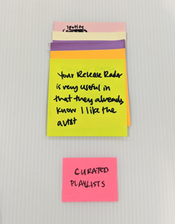
People use curated playlists for recommendations to discover new music
Insights
People build connections with other people through music
People tend to be doing other things while listening to music
People want to discover new music that they like
Needs
To be able to experience music with other people
To be able to find music appropriate for the current situation
To be able to find accurate recommendations
User Persona
Using what I learned from both my secondary and primary research, I created a user persona that accurately represented who I am designing for. This persona helped guide my decisions along the design process to make sure the solution I am designing is centered on our user. Meet Mike:
Define & IDeate
Defining the Problems
Now that I knew who I was defining for, I was able to use the insights and needs gained from research to identify what the main problems are that I am trying to solve. I used those insights and needs to create POV statements to better understand the problem from the user’s perspective and then created HMW questions to come up with possible solutions for these problems.
Brainstorming
I started the brainstorming process with mind mapping. Based on the HMW questions, I went through 10 minute rounds for each question and quickly generated as many different ideas as possible. I then went back in for a last round, 5 minutes each, to write down any new ideas or expand on existing ones.
How might we help Mike experience music with others to build deeper connections with them?
Group Brainstorming
After completing my own brainstorming, I still felt the need to explore different ideas. To help me with exploring other ideas that I haven’t thought of yet, I conducted a group brainstorming with my friends. Through this process, we worked as a team to come up with as many ideas as possible for the same HMW questions with discussions on each topic.
Project Goals
After coming up with different solutions for the main problems identified, I started to lay out the strategy in terms of how these solutions would be implemented. First, I started by clearly defining the project goals to understand what we’re trying to achieve through implementing these solutions.
Product Roadmap
After I had clear understanding of the project goals, I was able to make decisions on which solutions we should prioritize based on how effectively the solution would help us meet our goals.
Application Map
Now that I knew which solutions I would be moving forward with, I wanted to understand how these new features would fit into the existing architecture of Spotify’s application. In order to get a better understanding of this, I created an application map.
Task Flow
Now that I knew how these new features would fit into Spotify’s existing structure, I wanted to explore how the user’s would be interacting with these new features to complete key tasks. I first created a UI Requirements document to identify the key tasks based on our user’s goals, and then clearly laid out the specific requirements for each screen in order for the user to successfully complete those tasks.
Using the same key tasks, I created task flows to understand the actions the users would take and the key pages they would interact with to complete those tasks.
User Flow
Now I wanted to take an even deeper look into the overall user’s journey while interacting with the new features. In order to more deeply empathize with the user, I created a user flow to explore the scenarios the users would be in and the different paths and decisions they would encounter when trying to complete the key tasks defined.
Lofi Wireframe Sketches
Using everything I learned throughout this phase, I then worked on creating lofi wireframe sketches to make informed decisions on how to design these new screens to help our users complete these tasks and meet their goals.
Prototype & Test
Sketches to Prototype
In order to test the design decisions I had made and to test the usability of the design, I wanted to create a prototype to test on real users.
High Fidelity Wireframes
Using Figma, I first started by creating high-fidelity wireframes based on my sketches.
Prototype
Following my wireframes, I then used Figma to create an interactive high fidelity, limited functionality prototype that I would use for usability testing.
Usability Testing
Using the high fidelity, limited functionality prototype I created, I started to test my design on users to measure its usability and identify any areas of improvement.
Overview
Method: Remote, moderated usability testing (Think Aloud)
Participants: 5
Age: 27-31 years
Average Time: 6.2 minutes
Task Completion Rate: 100%
Error-Free Rate: 97.2%
Affinity Map
Taking all my notes and observations made during testing, I started to synthesize all the information through an affinity map. I was able to draw connections to uncover patterns which helped me identify design recommendations to improve the usability of my design.
Pain Points
I identified common pain points encountered by users during testing leading to my discovery of key insights which helped me to identify design recommendations.
5/5 users had difficulty finding the notifications screen.
5/5 users showed some confusion when viewing the Friends Recommend playlist screen.
3/5 had trouble finding the recommendations feature.
Insights
People want to have easier access to check their notifications
People were confused by the redundancy of the Recommendations flow
People expected the recommendations feature to be in the Settings screen
Recommendations
Add the notifications icon to the home page
Change the flow so that users are automatically directed to the Recommend Songs screen first before the playlist screen
Add the recommendations feature to the Settings
Priority Revisions
Using the recommendations identified through testing, I started to make these revisions in the high fidelity wireframes.
1. Add the notifications icon to the home page.
After
Before
2. Change the flow so that users are automatically directed to the Recommend Songs screen first before the playlist screen
Before
After
3. Add the recommendations feature to the Settings
Final Prototype
After completing the revisions, I updated my prototype with the revised design.
Reflection
& Next Steps
I faced new challenges during this project that I haven’t faced before - seamlessly integrating a new feature into an existing design and designing for a mobile application that I wasn’t entirely familiar with.
Through this project, I learned the importance of really diving into studying the existing design and flow of the application to introduce a new feature that looks and feels like Spotify’s existing design. Doing research on the background and how the app evolved was also key to identifying the best solutions for the problems at hand.
The next steps I would take this project through from here are:
1. Re-Test
To validate the revisions made, I would conduct another round of testing with users.
2. Implementation
Once I’ve re-tested to make sure the changes improved the features’ usability, we would then implement and launch these new features.